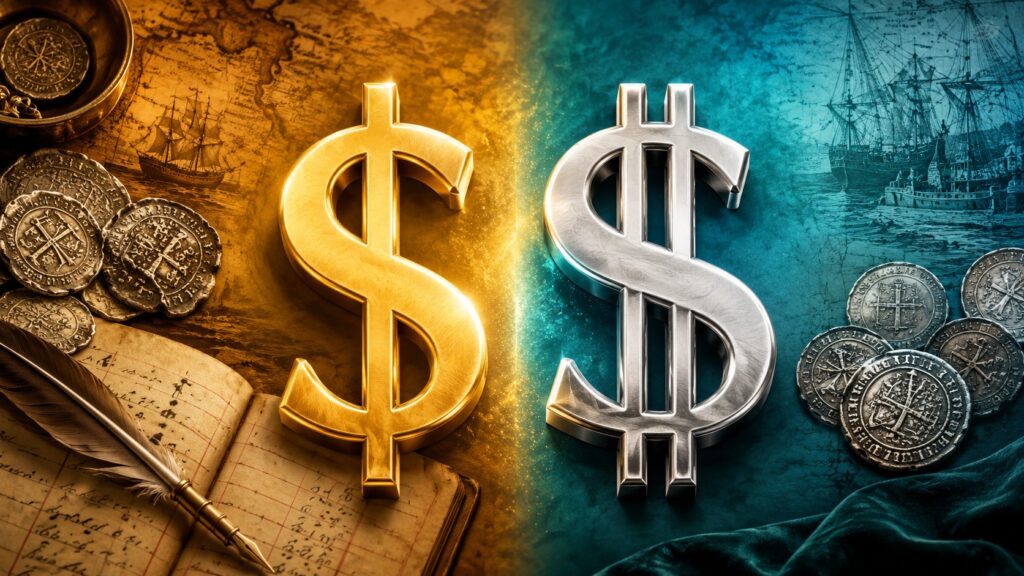
Some associate the difference in the dollar sign with the Mandela Effect
Ask several people you know to draw the sign of one of the most stable currencies in the world, the dollar, and you’ll be surprised at how different the results turn out. Some will draw the letter S with one vertical line, others with two. And almost everyone will be convinced that their version is the correct one. In fact, both are correct, and behind this lies an interesting story about fonts, Spanish coins, and one very persistent myth.
Why the Dollar Sign Looks Different
When you type the symbol $ on your keyboard, you enter the same character every time. In the computer, it’s stored under code U+0024 and is officially called DOLLAR SIGN. But exactly how it’s drawn — with one vertical line or two — is determined by the font.
Unicode (the international character encoding standard) explicitly states that the dollar sign has graphic variants: with one vertical line, with two, and with other minor differences. So the debate about vertical lines in the dollar sign is very similar to the debate about what the letter “a” should look like — printed, handwritten, with a tail or without. The meaning is the same, but the rendering differs.
How to Correctly Write the Dollar Sign
Today, the sign with one vertical line is most commonly seen. That’s how almost all computer and smartphone fonts render it, so in banking apps, financial spreadsheets, and on websites, we usually see a neat $ with a single line.
Encyclopaedia Britannica describes the basic form as follows: it’s a capital letter S crossed by a vertical line, while the variant with two lines is used less frequently. But less frequently doesn’t mean incorrectly. The sign with two lines hasn’t become an error — it simply turned out to be less convenient for modern typography.
Where the Dollar Sign Came From
This is where it gets really interesting. Contrary to logic, the symbol $ is not connected to the USA or the word “dollar” at all. The most widely accepted theory takes us back to the Spanish peso.
In colonial America, Spanish silver coins circulated — they were called various names: Spanish dollar, peso, piastre, or pieces of eight. These coins were an important unit of account long before the American dollar appeared, because they had a stable silver content.
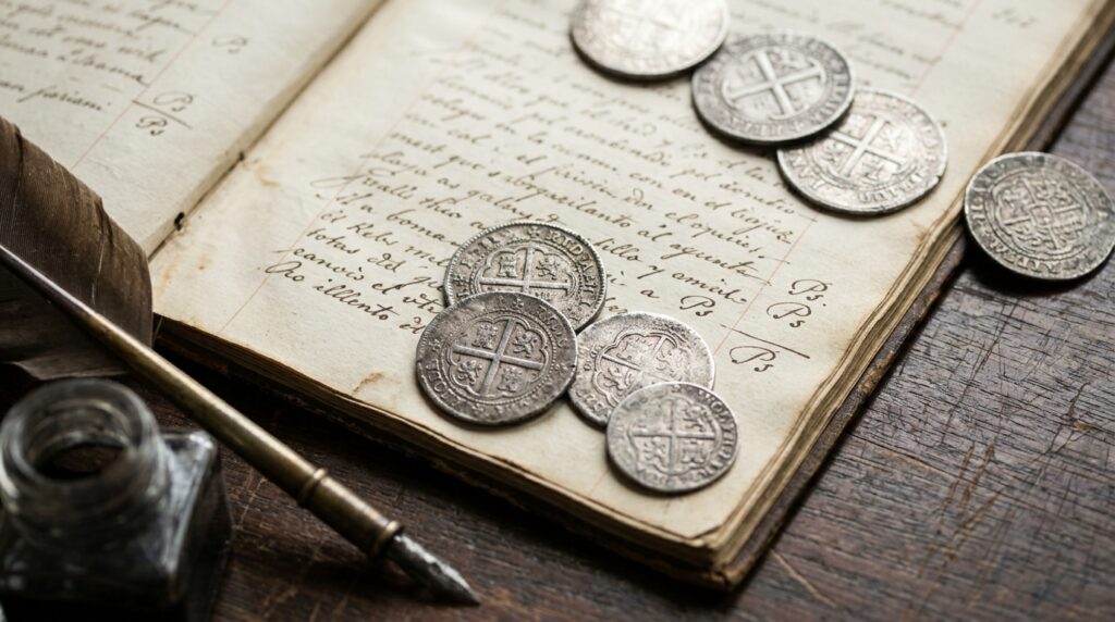
Spanish silver coins and the old abbreviation Ps in accounting records
The official website of the U.S. Bureau of Engraving and Printing explains that the $ sign evolved from the abbreviation Ps — the way pesos, piastres, or pieces of eight were denoted in bookkeeping. Over time, the letter S began to be written over the P, and gradually a form resembling the familiar symbol took shape. The United States officially adopted the dollar sign in 1785, but its roots are Spanish-American, commercial, and bookkeeping-related — not design-related.
Why Many People Are Convinced the Dollar Sign Has Two Lines
The variant with two lines is firmly embedded in popular consciousness, and there are several reasons for this.
- Two lines look more “monetary” and decorative — this is exactly the kind of sign that was drawn in caricatures, comics, advertisements, and on money bags.
- Many people remember this variant from childhood — from old textbooks, notebooks, and signs, so the modern $ with one line seems “new” or “incorrect” to them.
- There’s a persistent myth that the sign originated from the letters U and S — that is, from United States: the letter U was supposedly superimposed on the S, its lower part disappeared, and the two vertical lines remained.
Why the $ Symbol Isn’t Just for the U.S. Dollar
Here’s another detail people rarely think about. The $ sign is used not only for the American currency. It designates the Canadian, Australian, and New Zealand dollars, the Mexican peso, the Brazilian real (as R$), the Nicaraguan córdoba, and other currencies.
That’s why in international texts, people often write not just $100 but US$100, CA$100, or A$100 — to avoid confusion. And for complete precision, three-letter codes are used: USD, CAD, AUD. When discussing large sums — for example, how many billions of dollars it costs to return humans to the Moon — such precision is especially important.
Why the Dollar Sign Has Only One Line
The variant with one line has practical advantages. It’s simpler, looks cleaner at small sizes, and is more readable on screens. At small font sizes, two lines can merge together, especially on older displays, in narrow fonts, or with low-quality printing.
Moreover, font designers try to make currency symbols similar in width and style to digits so that amounts in tables look even. The sign with one line won not because the second line was abolished, but because it’s more convenient for interfaces and typography.
If you want to draw the dollar sign, follow this guide:
- In regular text, use the symbol from your keyboard — in most fonts it will display with one line, and this is a normal modern variant;
- In a drawing, comic, cover, or decorative illustration, you can confidently draw two lines — this is also historically acceptable.
The dollar sign has no single mandatory rendering. Both with one and with two vertical lines — it’s the same Unicode symbol, and the appearance depends on the font. Today, one line is more common, but two lines is not an error. And the most convincing theory of origin is linked not to the letters U.S., but to the old Spanish abbreviation Ps, which over time transformed into the familiar $.