Russia’s national messenger has been around for over a year, but questions about its name still haven’t died down. People write it differently: some say MAH, some say MAKS, some write “Maks” in lowercase. The platform’s CEO Farit Khusnoyarov finally gave a comprehensive answer in an interview with RT, and also explained what the logo means. For those who are just figuring out what this app is all about — this article will be especially useful.
Breaking down the name of the national messenger
MAH or MAKS — Which Is Correct
Here’s where it gets interesting. If you write it in Cyrillic, the correct form is МАКС (MAKS). M-A-K-S. Four letters, all Russian, reads like a name. There’s no “MAH” in reality. Those are Latin letters M, A, X, which visually resemble the Cyrillic М, А, Х. A pure optical illusion.
Officially, both spellings are considered equivalent: MAX in English and МАКС in Russian. The company uses both variants in official communications depending on the context. In Russian-language materials, the Latin MAX appears more often, although it should be read as “Maks,” not “Mah.”
Same thing, different angle
МАХ or MAX — technically these are different spellings of the same word. But online, the Latin version has become standard, and most users write it that way. Get used to the fact that the MAKS messenger looks like a foreign word on screen, even though it’s positioned as a thoroughly domestic product. The irony of the situation apparently bothers no one.
What Does the Name MAX Mean
MAX is short for “maximum.” The official concept goes like this: a platform with a “maximum of possibilities” for communication, receiving services, and interacting with businesses and government. The name of the MAX messenger was chosen precisely with this idea in mind. Maximum features, maximum reach, maximum integrations. Sounds ambitious, especially if you remember that at launch the messenger had no channels, no proper search, nor half of what Telegram offers.
That said, over the past year the MAX app has indeed gained quite a few features. Digital ID appeared — the MAX messenger was effectively equated to a passport in a number of situations. You can make a doctor’s appointment, use Spherum, and access government services. Whether it truly offers maximum possibilities is debatable, but there’s definitely something behind the name. Though scammers in MAX have also appreciated the platform’s maximum capabilities and are actively using them.
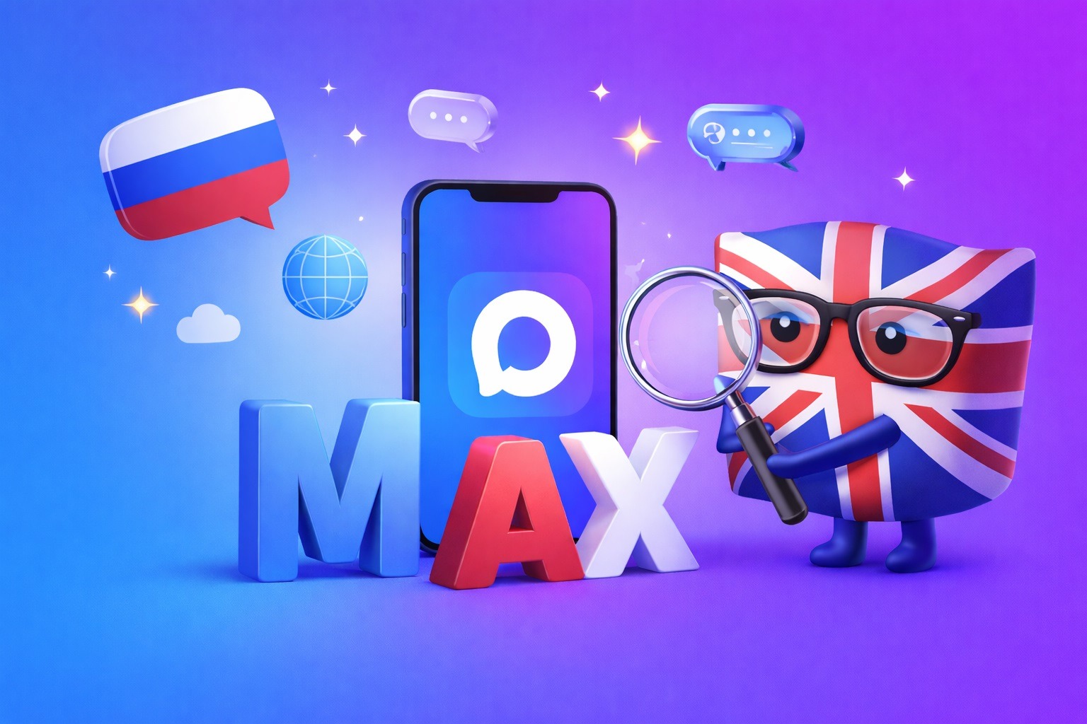
Why MAX Is in English
A logical question: if the messenger is national and Russian, why is its name MAX in English rather than Cyrillic? The official answer is quite logical: international ambitions. According to the company, MAX is written in English intentionally — the messenger already operates in 40 countries, its audience abroad exceeds 6 million people, and the English version has been officially launched. The Latin spelling simplifies promotion outside Russia.
The messenger is Russian, but the name is written in English
MAKS in Russian is a perfectly workable option for domestic use, but in the era of globalization, Cyrillic in the name would be an additional barrier for foreign users. That’s why the national MAX messenger deliberately chose Latin script to make it easier to explain to foreigners what the app is. Although the question of why foreigners would need a Russian government messenger remains open.
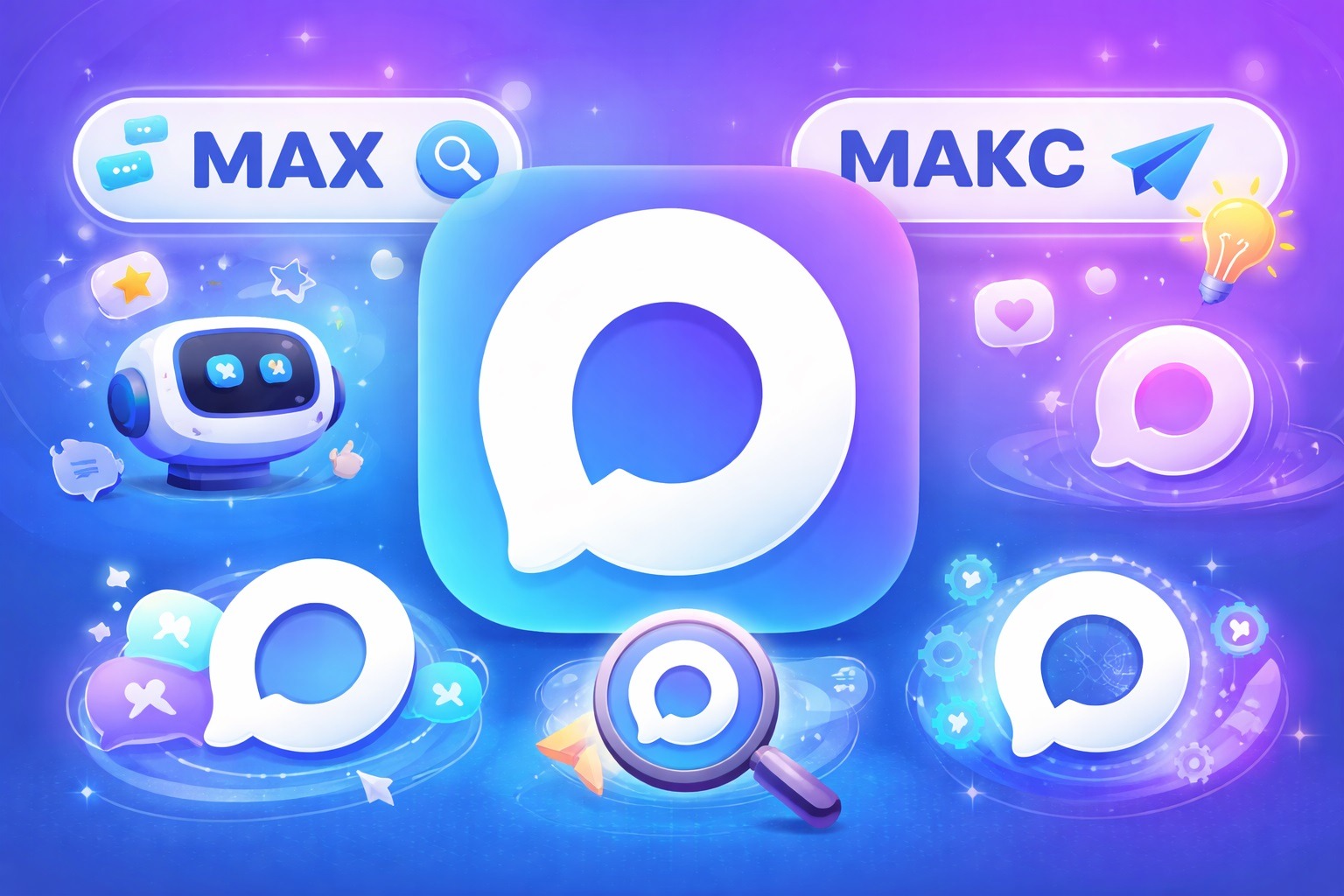
What Does the MAX Logo Mean
The MAX messenger logo is a stylized message bubble. According to Khusnoyarov, the symbol references friendly communication and helps users quickly find the app on their smartphone screen. The minimum goal is that the icon doesn’t get confused with something else.
The MAX logo is done in a gradient of blue and purple shades. The color choice is deliberate: most messengers use green, blue, or purple shades separately, so for MAX they chose a gradient of two colors at once. This is supposed to emphasize “technology and multifunctionality” — I’m quoting the official explanation without edits.

The logo situation is also ambiguous
Whether they succeeded in standing out visually is a matter of taste. The icon is indeed memorable, although it seems similar to dozens of other messengers at the same time.